The downloaded brush promises delicate washes and ragged pigment edges, but the first Photoshop stroke looks like a row of identical stamps. After some adjustments, the artwork looks convincing on screen, yet the printed sample comes back duller than expected. Then a client asks whether the brush is cleared for commercial use.
A successful aquarelle brush Photoshop workflow needs more than an attractive preset. Aquarelle means watercolour, and its digital equivalent relies on transparent colour, irregular marks, paper texture and restraint. For illustrators selling commissions, prints, downloads or lessons, the process also needs clear permissions and a reliable export method.
Table of Contents
- Confirm Licence Terms Before You Sell Your Artwork
- Install Aquarelle Brushes and Find Them in Photoshop
- Brush Settings That Make Watercolour Look Real
- How to Build a Layered Watercolour Painting
- How to Turn a Photo into a Watercolour Effect
- Export Watercolour Artwork Without Muddy Prints
- Common Problems and How to Fix Them
Confirm Licence Terms Before You Sell Your Artwork
A visually perfect brush can still be unsuitable for a commissioned illustration, greeting card range or paid course. Permission to download a brush isn't the same as permission to use it commercially, and permission to sell finished artwork doesn't necessarily include permission to distribute the brush itself.
The myPhotoshopBrushes FAQ directs users towards the terms attached to individual resources rather than a universal commercial-use assumption. The practical decision belongs at pack level: who created it, who grants the licence, and which uses that licence permits.
Finished artwork and reusable assets are different
Consider an illustrator painting a floral wedding invitation. Delivering a flattened illustration to the couple is different from selling an editable template containing reusable assets, and different again from giving students the original ABR file during a workshop.
A licence might permit the finished illustration while restricting redistribution, sublicensing or inclusion in an asset library. Attribution requirements and team-use limits also need attention, especially when freelancers collaborate with an agency.
For sellers considering reusable downloads, AmaJova's guide to PLR digital products offers a related starting point. Rights attached to one resource don't automatically apply to another, even when both are described as commercially usable.
A practical licence checklist
- Identify the licence holder. Record the creator or rights owner and save the licence text alongside the downloaded pack.
- Confirm paid client work. Look for permission covering commercial commissions, not merely personal artwork or portfolio display.
- Check products and templates. Establish whether finished prints, downloadable illustrations, editable templates and educational materials are permitted.
- Record conditions. Note attribution wording, redistribution restrictions, sublicensing rules and any limits on team access.
- Keep project evidence. Retain the licence, purchase receipt where applicable, pack version and a note identifying which projects used it.
Practical rule: A brush should enter a commercial project only when its permitted use is clear enough to explain to the client.
An unclear free pack may cost more in replacement work than a paid pack with suitable terms. The risk isn't limited to the purchase price: replacing a recognisable texture across packaging, print files and promotional images can interrupt an entire delivery.
Pack selection should therefore begin with the licence, followed by installation and testing. This is general guidance rather than legal advice; ambiguous terms need clarification from the rights holder, and high-value projects may justify professional advice.
Install Aquarelle Brushes and Find Them in Photoshop
The file has downloaded, but nothing new appears beside Photoshop's familiar round brushes. Usually, the missing step is importing the brush set, rather than opening it as an image.
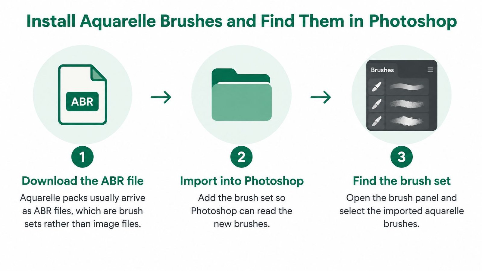
Aquarelle packs commonly arrive as ABR files. An ABR stores brush presets, not a Photoshop document or a standalone installer. An archive containing the ABR needs extracting before Photoshop can import the brush file.
The installation sequence is straightforward, although menu names differ between Photoshop versions.
Import the pack without losing the working set
- Locate the extracted ABR. The creator's download may also contain licence documents and preview images. Those belong in the project resource folder, but only the ABR is imported as a brush set.
- Open the relevant import control. In current Photoshop versions, the usual route is Window > Brushes, followed by the panel menu and Import Brushes. Older versions may use Edit > Presets > Preset Manager.
- Select the brush file. In a legacy Preset Manager that supports brushes, the artist selects Brushes as the preset type, chooses Load, and selects the ABR.
- Find the imported group. After closing the dialogue, the artist opens Window > Brushes and checks the bottom of the list. Imported sets may sit inside a collapsed folder.
- Make a delivery-size test. A blank document matching the intended artwork dimensions gives a more useful check than the tiny preset thumbnail.
If familiar brushes disappear
Legacy preset dialogues can distinguish between loading, replacing and appending sets. Where Append is offered, it retains existing presets; a replacement operation can remove them from the visible working list.
The recovery is to restore the default set and append the downloaded pack, rather than repeatedly replacing one set with another. Current Import Brushes workflows normally add a group, so a missing brush may instead be inside a closed folder.
A textured wash preset should produce irregular edges or pigment variation when tested at a suitable size. A solid round dot suggests the wrong preset, an unsuitable scale or settings that need adjustment, rather than proof that the import failed.
Brush Settings That Make Watercolour Look Real
Watercolour brush settings and starting values
These are suggested test settings, not universal specifications. A preset's underlying tip and texture can make the same values behave very differently.
| Setting | Where to find it | Starting value | What it changes |
|---|---|---|---|
| Shape Dynamics, size jitter | Brush Settings panel, Shape Dynamics | 10–30% | Stops every mark being the same size |
| Shape Dynamics, angle jitter | Brush Settings panel, Shape Dynamics | 10–30% | Varies stamp orientation so marks don't line up |
| Scattering, scatter | Brush Settings panel, Scattering | 5–15% | Spreads marks off the stroke line for granular texture |
| Transfer, opacity jitter | Brush Settings panel, Transfer | 10–30% | Varies pigment strength between marks |
| Transfer, flow jitter | Brush Settings panel, Transfer | 10–30% | Builds uneven wash density across the stroke |
| Wet Edges | Brush Settings panel | On, with a subtle overall effect | Darkens the rim of each stroke as pigment pools |
| Opacity and Flow | Options bar | 30–50% for initial wash tests | Keeps each pass transparent so washes can build |
A brush tip repeats along the stroke path. When every impression has the same size, angle and spacing, the result resembles a pattern rather than deposited pigment. Controlled variation breaks that repetition without making the brush unpredictable.
Separate transparency from variation
Opacity limits the transparency of a brush application, while Flow controls the rate at which colour builds during painting. Their jitter controls vary those properties between impressions. Increasing every control together makes it difficult to identify which adjustment improved the stroke.
A useful test sheet contains a reference swatch followed by labelled alternatives. The illustrator changes one setting, paints the same movement at the same brush size, then compares the results.
Wet Edges deserves particular care. It is an on/off brush option, not a separate strength slider. A low-strength appearance comes from the surrounding brush settings and restrained application; if the rim becomes conspicuous, the artist can disable it or reduce the overall effect.
A convincing wash needs variation within a coherent shape, not random marks everywhere.
Match the settings to the job
Detail brushes need less scatter so stems, facial features and architectural lines remain controlled. Broad background washes benefit from flow variation, while small illustrations need texture checked after reduction.
Visual references can help distinguish loose colour from uncontrolled noise. Artists comparing expressive edges across media can explore watercolor tattoo techniques through TattoosAI, while recognising that Photoshop settings don't simulate skin, ink or tattoo application.
At 100 per cent zoom, the useful check is simple: the wash should show uneven, softened edges without an obvious repeated stamp. Texture should support the subject rather than compete with it.
How to Build a Layered Watercolour Painting
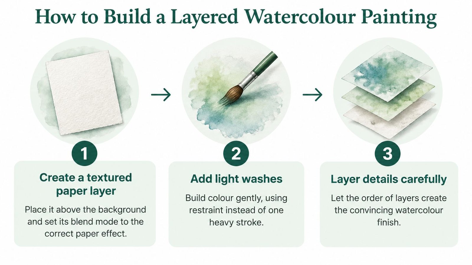
A convincing digital watercolour comes from layer order and selective painting, not a heavy pass with an expensive brush. Separate layers let the illustrator adjust paper, drawing and pigment independently, which is especially useful when a client requests a colour change.
Adobe UK's watercolour demonstration combines textured groundwork, Multiply blending and repeated low-opacity, low-flow strokes. The important distinction is that the brush supplies a mark-making vocabulary; the artist still controls composition, colour relationships and where the paper remains visible.
The layer sequence keeps those decisions editable.
Establish paper, drawing and broad colour
- Create the paper foundation. A light paper texture sits above the background on its own layer. Multiply allows the lighter areas to recede while retaining darker grain; its opacity should be reduced if the paper looks dirty before painting begins. A strongly coloured texture can tint every subsequent decision, so a neutral starting surface is easier to judge.
- Keep the sketch separate. The drawing belongs on a named layer with reduced opacity. It should guide placement without becoming an accidental dark outline in the finished illustration. Hiding it periodically reveals whether the painted forms work independently.
- Build the base wash gradually. A broad aquarelle brush establishes the main colour areas through light passes. Changing brush size and rotation prevents a recognisable stamp from appearing across every leaf or cloud. The common mistake is repeatedly painting over an unsatisfactory area until it becomes opaque.
For a botanical illustration, the base wash might establish the pale green silhouette of a leaf. Its darker central fold and smaller veins belong later, rather than being forced into the first stroke.
Add structure without filling every gap
- Separate the detail washes. Shadows, local colour changes and accents belong on additional named layers. Multiply can help transparent colour interact, but it needn't be applied automatically to every layer. A detail layer that becomes too dark can be lightened or removed without disturbing the broad wash.
- Preserve deliberate negative space. Unpainted areas can represent reflections, pale petal edges or gaps between foliage. These spaces are part of the image, not unfinished areas requiring another pass. Painting them back with white may produce a different surface appearance from leaving the underlying paper untouched.
Uniform spacing and repeated identical impressions are warning signs that the brush is doing too much of the drawing. A different stroke direction, a smaller brush or a selectively erased edge often helps more than another texture overlay.
A pressure-sensitive tablet makes tapering and density changes easier. A mouse remains usable when pressure-dependent controls are disabled and the artist relies on deliberate changes in brush size and separate passes.
Before delivery, the illustrator checks the artwork at its intended output dimensions. Scaling changes the apparent grain and edge irregularity, so a pleasing enlarged canvas isn't enough to approve the final result.
How to Turn a Photo into a Watercolour Effect
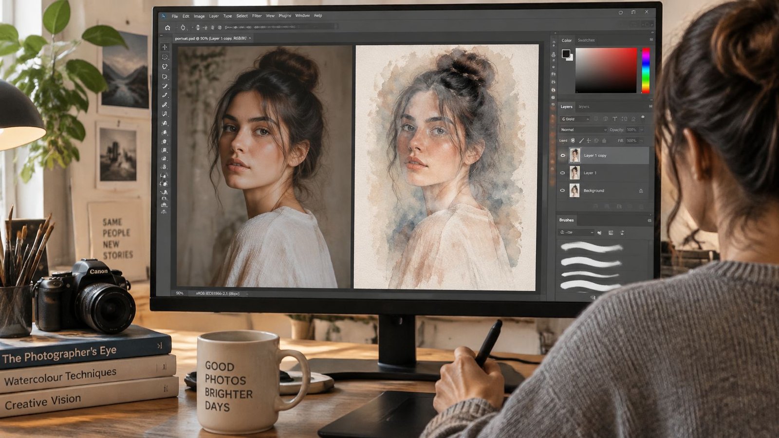
A photo-based route suits a portrait or scene whose composition needs to remain recognisable. The aim isn't to hide the photograph beneath filters, but to translate its important shapes into selective painted areas.
The portrait workflow below retains an editable original while allowing the brushwork to determine which parts remain visible.
Build an editable treatment
- Protect the source photograph. The artist duplicates the photo, retains the untouched original and converts the working copy to a Smart Object. Supported filters then remain adjustable.
- Apply a restrained Dry Brush effect. Under Filter > Filter Gallery > Dry Brush, the Spoon Graphics tutorial uses brush size 10, brush detail 10 and texture 1 as starting settings. These are reference-image settings, not a universal recipe.
- Introduce paper texture. A separate texture layer sits above or below the treated photograph. Its scale should resemble a believable paper surface, rather than enlarged ridges running through the face.
- Reveal through a mask. A black-filled layer mask conceals the treated image. Painting white onto that mask with aquarelle brushes reveals selected areas; switching back to black conceals an overworked passage without deleting the image.
- Retain detail selectively. Eyes, a roofline or a distant tree can remain legible while surrounding areas dissolve into looser washes. Restoring the entire photograph usually defeats the painted treatment.
Retune for the actual canvas
Filter values tuned for one pixel density don't transfer reliably to another. The practical fix is to retune the effect in relation to the target canvas, then compare the subject's important features rather than chasing identical slider positions.
Overworked edges are another common problem. A mask should allow interruptions and variation, not trace a uniformly ragged border around the whole subject.
Source-image rights also need checking before commercial delivery. AmaJova's guide to selling stock photos provides related context for photographers considering how original images become saleable assets.
For screen delivery, a flattened PNG or high-quality JPEG should use the final pixel dimensions, while the layered PSD remains the master. Before export, the artist inspects edges and paper texture at actual-pixel view and compares proof versions at the intended web and print sizes.
Export Watercolour Artwork Without Muddy Prints
A realistic brush doesn't guarantee a convincing print. When a vivid screen image prints darker or less saturated, the first checks belong to colour handling, paper and overlapping translucent layers, not necessarily the preset.
Genesis Imaging's printing guidance recommends Adobe RGB (1998) for its controlled photographic printing workflow, accepts other profiles and supplies an ICC profile for soft proofing. It also notes that accurate previews depend on a calibrated monitor. That recommendation belongs to the provider's workflow, rather than every printer.
Prepare a printer-specific copy
Soft proofing previews the artwork through an output profile to approximate the printed result. It helps reveal tonal and colour changes before production, but it doesn't replace a physical sample.
- Confirm specifications. The printer's accepted colour profile, file format, dimensions and paper choice determine the export.
- Keep the master in RGB. A separate output copy can be converted to the requested profile. Assigning a different profile isn't a substitute for a controlled conversion.
- Inspect the soft proof. Pale washes should remain distinct from grey contamination, and shadow overlaps should retain useful detail.
- Flatten only the delivery copy. The artist checks the flattened result against the layered master, paying particular attention to stacked Multiply washes.
- Order a real-size proof. A sample on the intended stock reveals texture and tonal behaviour that a monitor can't reproduce.
If the printer requests CMYK, comparison with the RGB master helps identify changes in saturated blues and greens. CMYK output commonly has a more restricted gamut in those areas; the supplied profile gives a more useful preview than a generic conversion.
For photo-led artwork, Nim's guidance to prepare photos for AI enhancement offers related colour-correction context, although the printer's specifications remain decisive for output.
Paper grain, painted pigment variation and digital brush texture should remain distinguishable. Excessive detail across all three can read as noise, especially in downloadable pages such as those discussed in AmaJova's digital colouring book guide. A physical proof helps establish which texture survives production.
Common Problems and How to Fix Them
The symptom table offers the quickest starting point. Brush controls should be checked before the layer stack, followed by output dimensions, because a small settings adjustment is cheaper than rebuilding the painting.
Aquarelle brush symptoms, causes and fixes
| Symptom | Likely cause | Fix |
|---|---|---|
| Marks repeat and look stamped | Even spacing with no jitter | Add size, angle and scatter jitter in Brush Settings |
| Washes look flat and digital | Opacity too high, single pass | Lower opacity and flow, then build in several passes |
| Edges look hard and mechanical | Wet Edges off or producing an excessive rim | Test Wet Edges and keep the overall rim subtle |
| Colours go muddy when stacked | Many overlapping Multiply layers | Reduce redundant washes and check overlaps in a soft proof |
| Texture disappears at print size | Texture tuned at screen size | Retune texture scale for the final canvas |
| Brush missing after install | A legacy replacement load displaced the working set | Restore the set, then use Append where available, or Import Brushes |
Diagnose before repainting
A mechanical border doesn't always need Wet Edges. The artist can toggle the option on a duplicate test layer; if the border becomes more pronounced, the brush tip, spacing or mask is the better place to investigate.
Muddy overlaps may improve after a redundant wash is hidden or its opacity reduced. Merging layers alone doesn't remove muddiness: it preserves their combined appearance, so unwanted density needs correcting before consolidation.
Recovery check: An editable layer can often be corrected; opaque painting baked into a flattened image may need rebuilding.
A base wash painted too heavily can lose its lighter structure when reduced or erased. In that case, repainting the broad wash beneath retained detail layers may be more effective than repeated rescue adjustments.
After each change, the artist paints a single delivery-size test stroke and compares it with the previous version. That small comparison makes improvement visible without risking the finished artwork.
AmaJova offers structured OfferLinks for physical products, digital downloads, services and live sessions, with clear inclusions, pricing and fulfilment or booking details. An illustrator ready to package a watercolour print, commissioned portrait or brushwork lesson can visit AmaJova and define exactly what the buyer receives before publishing the offer.